Visitly Analytics gives you real-time visibility into how visitors and deliveries move through your workplace. Two dedicated dashboards, Visitor Analytics and Delivery Analytics, turn your raw activity data into clear trends so your team can plan staffing, strengthen security, and catch operational issues before they become problems.
What Analytics Includes
Analytics offers two dashboards so you can monitor workplace activity at a glance.
Visitor Analytics
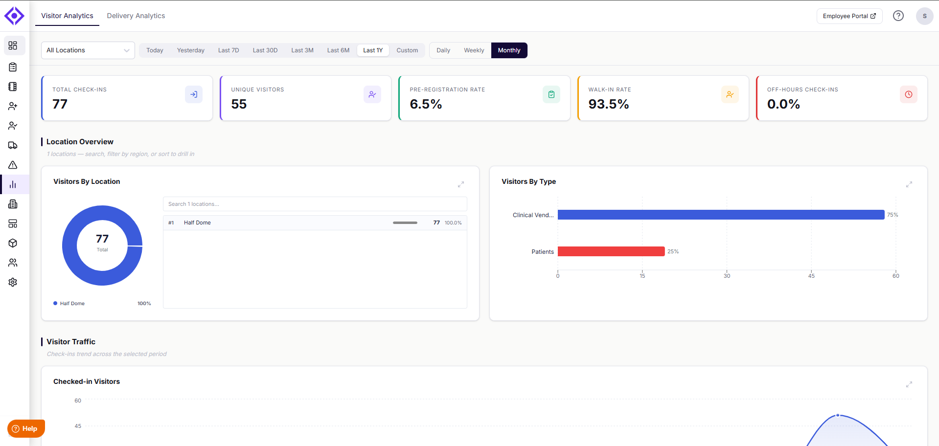
Visitor Analytics shows how visitors flow through your workplace, so you can plan staffing, strengthen security, and make the most of your space. Five summary tiles at the top give you an instant read on activity: Total Check-ins, Unique Visitors, Pre-Registration Rate, Walk-in Rate, and Off-Hours Check-ins.
Below the summary tiles, your data is organized into the following sections:
- Location Overview — See how visits are distributed across your locations, and how visitors break down by type (e.g., Clinical Vendors, Patients).
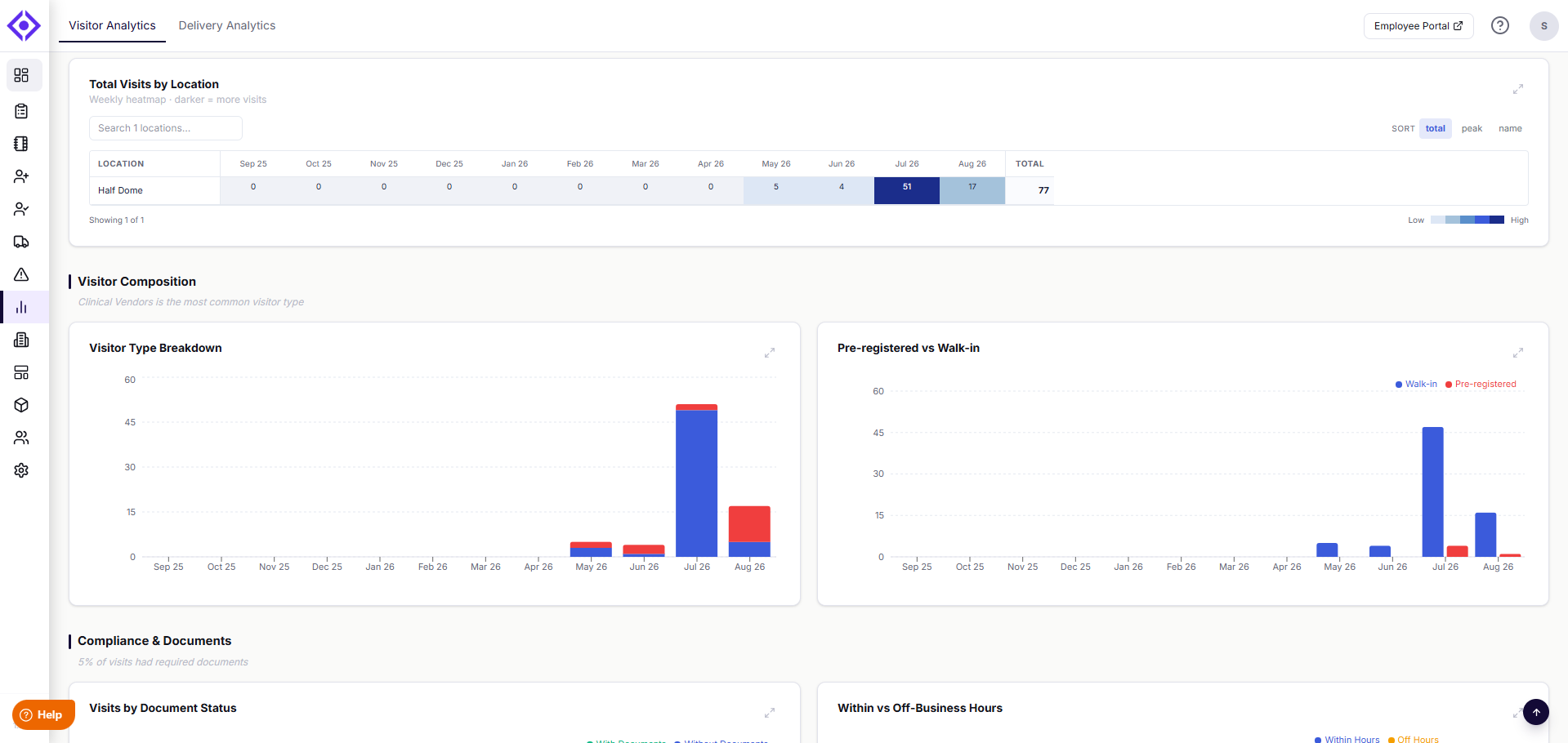
- Visitor Traffic — Follow check-in trends over time, and see total visits by location as a weekly heatmap.
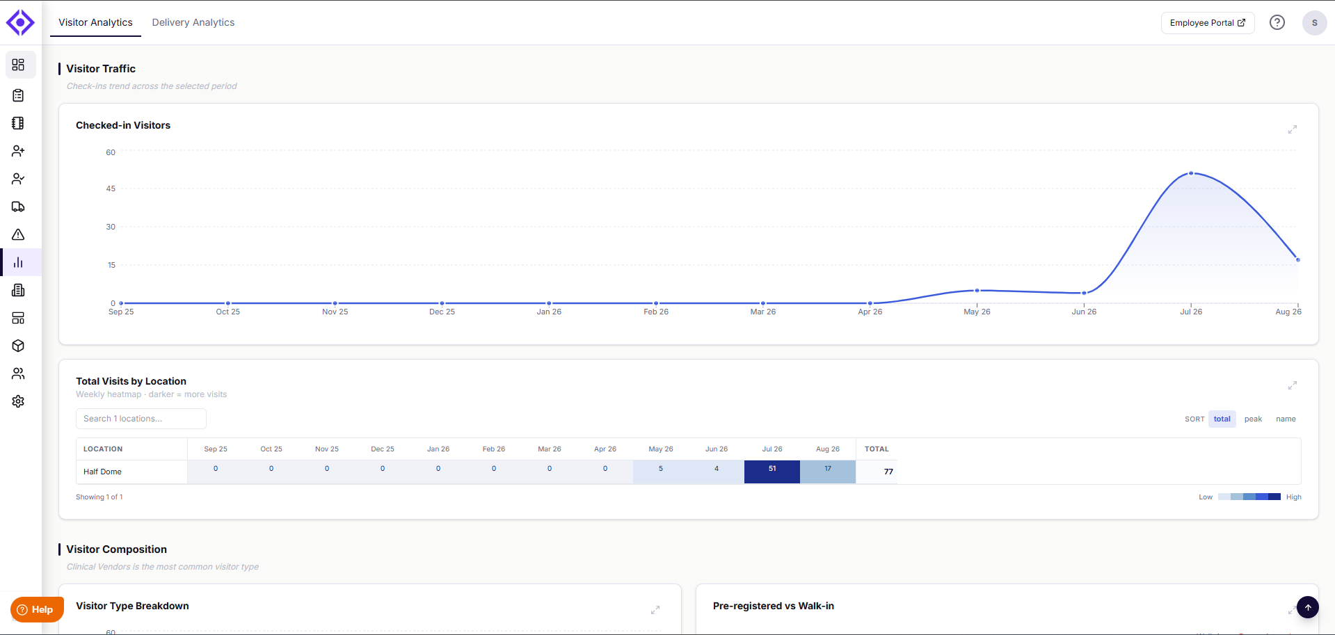
- Visitor Composition — Compare visitor types side by side, and see how pre-registered visits stack up against walk-ins.
- Compliance & Documents — Check what share of visits had required documents on file, and how visits break down between business hours and off-hours.
- Behavioral Insights — Identify your top hosts by visit volume, and spot peak visiting times across the week with an hour-by-day heatmap.
- Monthly Trend — Track visitor volume across all your locations over a 12-month view, so seasonal patterns are easy to spot. This section always reflects your full account, regardless of any filters applied above.
Delivery Analytics
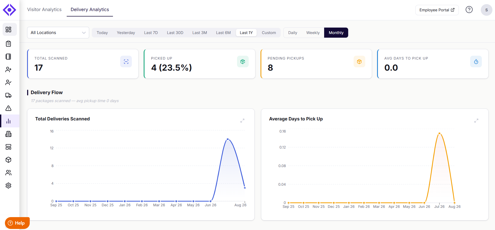
Delivery Analytics helps you keep a close eye on delivery operations to reduce lost packages and keep your mailroom running smoothly. The dashboard opens with four key tiles: Total Scanned, Picked Up, Pending Pickups, and Avg Days to Pick Up.
From there, your data is grouped into the following sections:
- Delivery Flow — See how many deliveries were scanned over time, and track the average time it takes for packages to be picked up.
- Pickup Performance — Compare deliveries picked up against those still pending, so you can spot backlogs early.
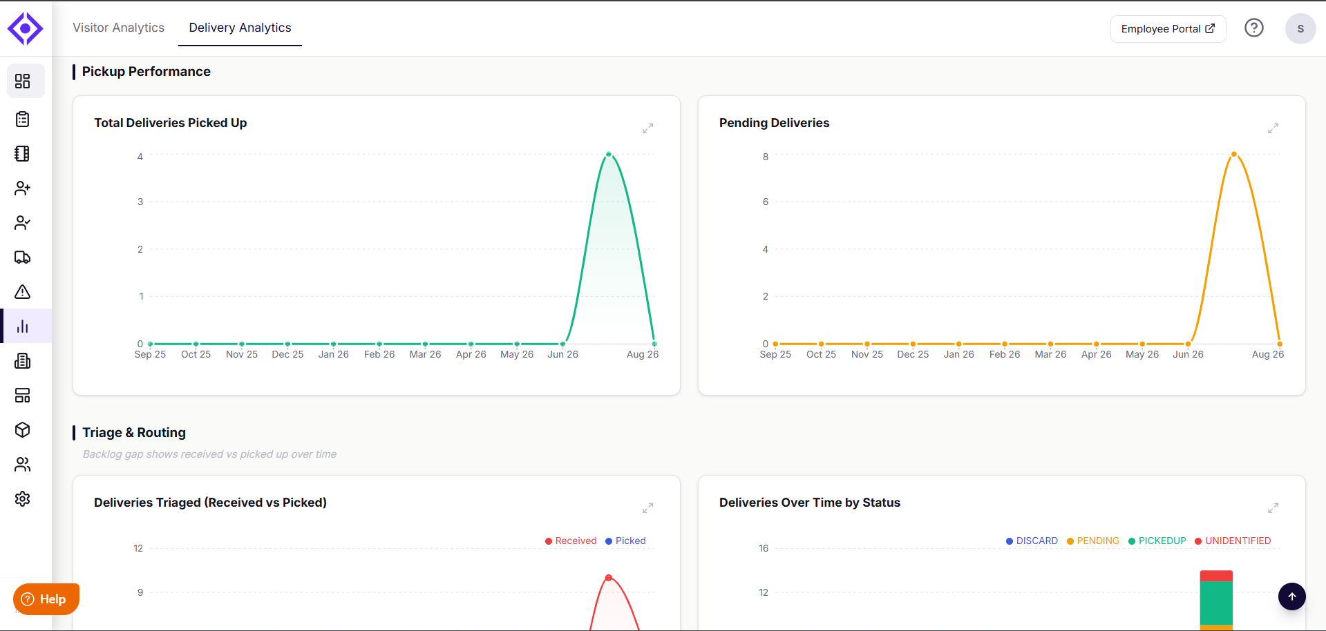
- Triage & Routing — See received versus picked-up volume over time, a status breakdown of every delivery (discarded, pending, picked up, unidentified), and which delivery areas see the most activity.
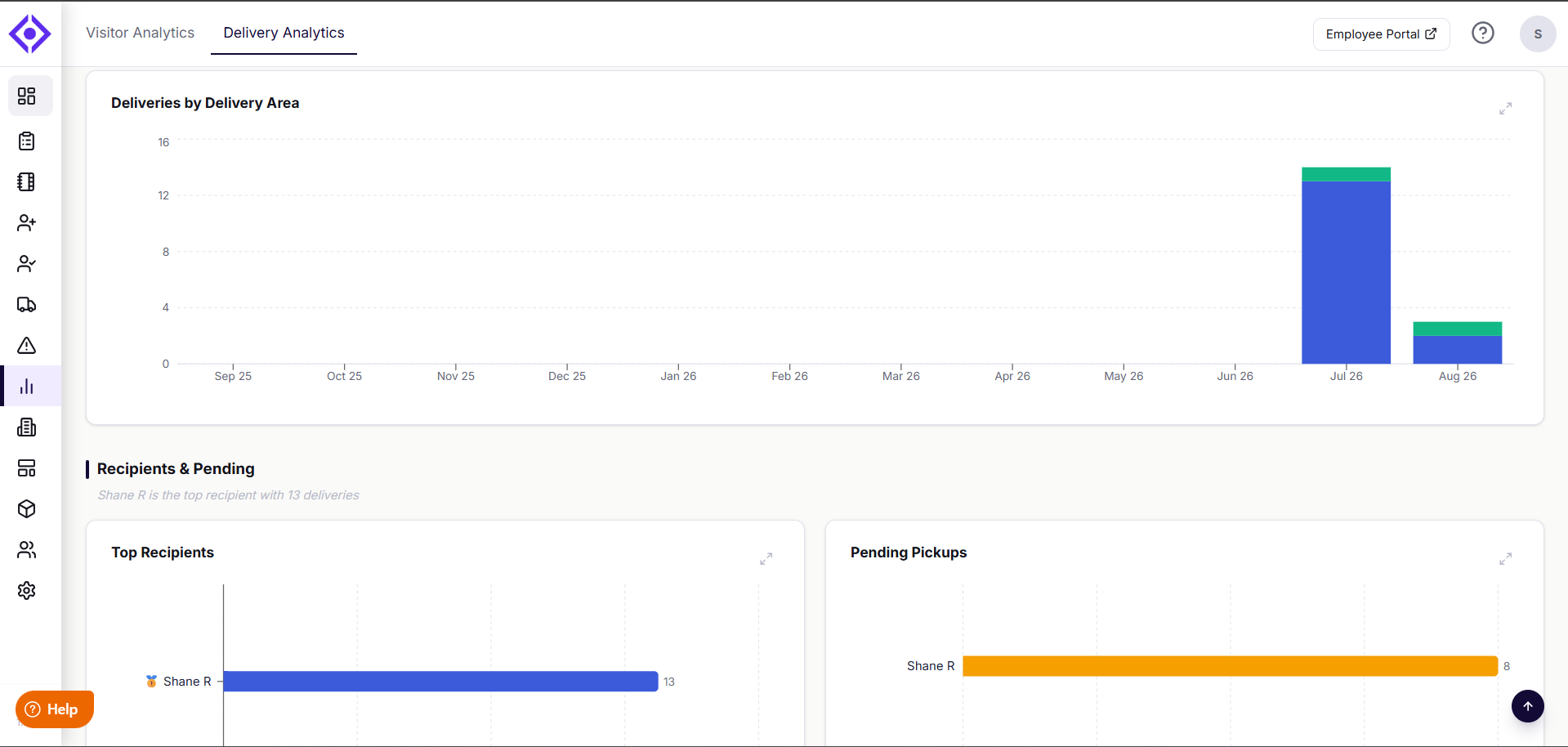
- Recipients & Pending — Identify your top recipients by delivery volume, and see who has the most packages currently waiting for pickup.
Exploring Your Charts
Every chart on both dashboards can be explored in more detail. Hover over any point on a chart to see the exact figures behind it. Select the expand icon in the top-right corner of any chart to open an enlarged view. From there, select the print icon to print the chart or save it as a PDF, which comes in handy for sharing insights in a meeting or including them in a report.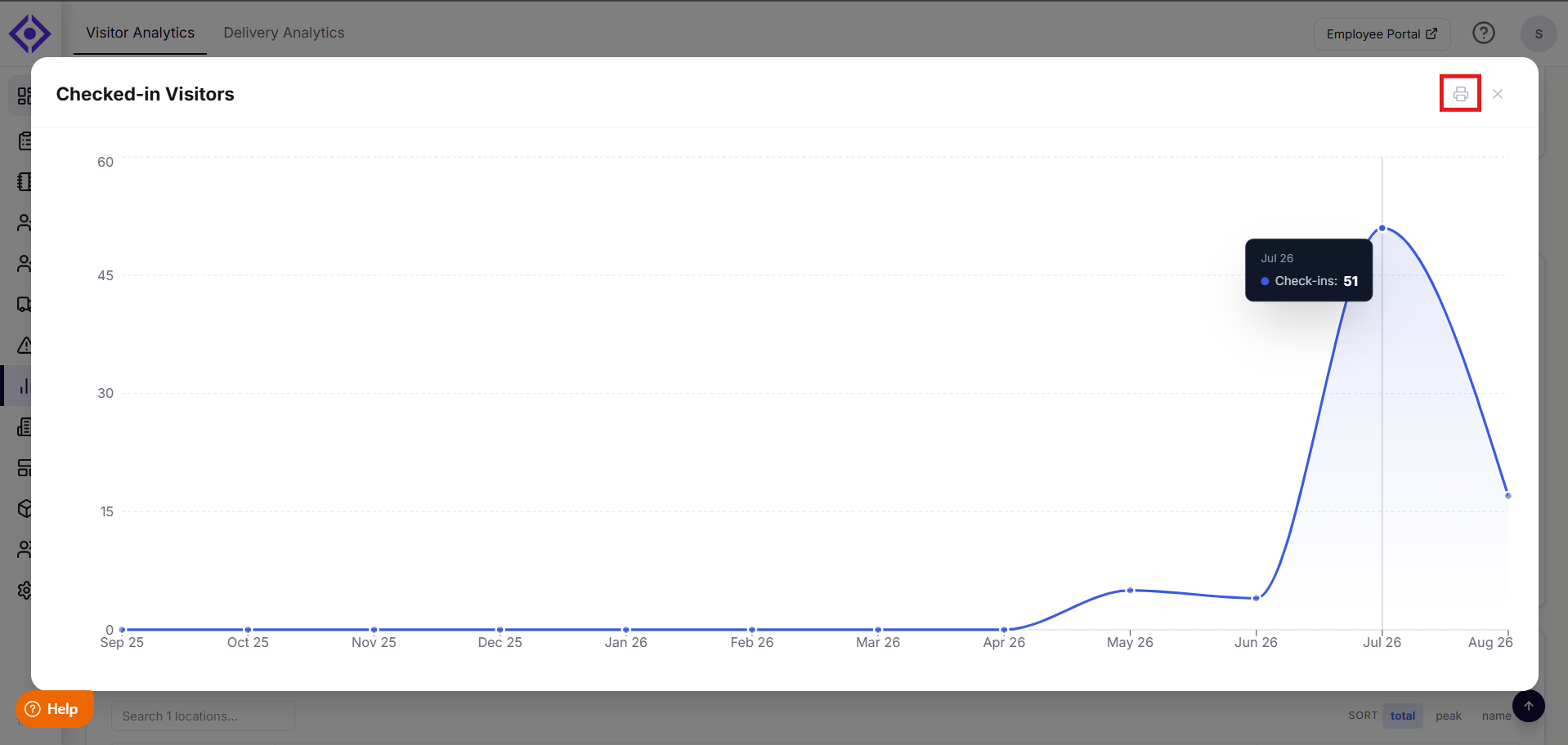
Filters and Views
Both dashboards come with filters that let you drill into exactly the data that matters most to you:
- Location — Focus on All Locations or a specific site.
- Time Range — Choose from Today, Yesterday, Last 7D, Last 30D, Last 3M, Last 6M, Last 1Y, or set a Custom range.
- Time Breakdown — View your data as Daily, Weekly, or Monthly trends.
Within individual widgets, you'll also find contextual filters, such as searching for a specific location in the Visitors By Location list, or sorting the location heatmaps by total, peak, or name.
Why Use Visitly Analytics?
- See trends clearly — Visual dashboards surface key workplace patterns at a glance, without digging through raw data.
- Save time — Replace manual logs and spreadsheets with insights that update automatically.
- Make smarter decisions — Catch operational issues early, whether that's a delivery backlog or an unexpected spike in off-hours visits.
- Empower every team — From front desk staff to facilities managers, give everyone the visibility they need to do their job well.
Troubleshooting
Why don't I see the Analytics dashboards in my account?
Analytics is a subscription-based add-on for Business and Enterprise plans. If it's not enabled for your account, contact support@visitly.io to request access.
Why does the Monthly Trend section look different from the rest of the dashboard?
Monthly Trend always reflects your full account across a 12-month view. Unlike other sections, it doesn't respond to Location, Time Range, or Time Breakdown filters, so seasonal patterns stay consistent regardless of what you're filtering elsewhere on the page.
Why can't I print a chart directly from the dashboard view?
Printing is only available from the enlarged chart view. Select the expand icon in the top-right corner of the chart first, then select the print icon to print it or save it as a PDF.
Why does a location I know had activity show zero visits or deliveries?
Check that the correct location is selected in the Location filter and that your Time Range covers the period you expect. If the location was recently added, confirm it has been active long enough to generate data for the selected range.
Note: Analytics is included on every Visitly plan — Starter, Business, and Enterprise. Business and Enterprise plans also unlock Advanced Analytics, with deeper insights. For a full comparison, see our pricing page.
Need help? Contact the Visitly support team at support@visitly.io
Was this article helpful?
That’s Great!
Thank you for your feedback
Sorry! We couldn't be helpful
Thank you for your feedback
Feedback sent
We appreciate your effort and will try to fix the article